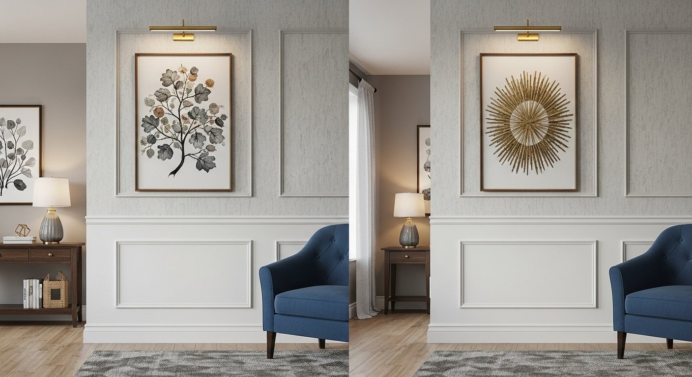
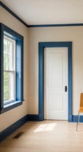
Ever walk into a room and think, “Okay… this feels expensive”—even if you know it’s not? Nine times out of ten, it’s not a chandelier or a marble floor doing the heavy lifting. It’s the contrast trim. Yep, that thin (or sometimes chunky) strip of color framing your walls can totally change the vibe of your space.
I’ve been a sucker for contrast trim for years. It’s like the eyeliner of home décor—sometimes subtle, sometimes bold, but always transformative. And the best part? You can pull it off without a degree in interior design or a budget that looks like a lottery win.
So, let’s talk about 13 color combinations that’ll instantly make your rooms look curated, intentional, and seriously Insta-worthy. Ready? Let’s roll.
1. White Walls + Black Trim
Classic? Yes. Boring? Never.
White walls with black trim are like the little black dress of home décor—always in style. The crisp contrast makes your room look polished and modern without even trying.
Why it works:
-
Black outlines make architectural details pop.
-
Works with literally any furniture style—modern, farmhouse, industrial, you name it.
Pro Tip: Go for a satin or semi-gloss finish on the trim for that subtle shine.
2. Soft Gray Walls + Crisp White Trim
If you’re into that clean, calm vibe, soft gray walls with white trim are your BFF. It’s neutral without being meh.
Why it works:
-
White trim brightens the gray and makes it look fresh.
-
Perfect backdrop for pops of color in art or textiles.
Ever walked into a home and felt instantly relaxed? This combo is that.
3. Navy Walls + White Trim
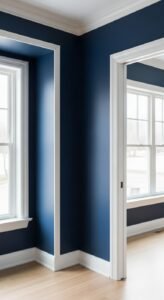
This one’s a total showstopper. Navy walls with bright white trim = instant drama (the good kind).
Why it works:
-
The white trim slices through the deep blue, keeping it from feeling too dark.
-
Navy feels luxurious and timeless.
IMO, if you want to make a dining room look high-end without dropping $$$ on a designer, this combo delivers.
4. White Walls + Forest Green Trim
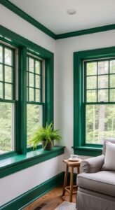
Okay, hear me out—forest green trim is massively underrated. On white walls, it’s fresh, organic, and just a tiny bit daring.
Why it works:
-
Gives a nature-inspired feel without going full “cabin in the woods.”
-
Pairs beautifully with wood furniture.
FYI: Works wonders in sunrooms or kitchens with a lot of natural light.
18 Tips for Choosing Contrast Trim Colors for Home Decor Inspiration
5. Cream Walls + Charcoal Trim
If you want contrast but not the full white-black drama, cream walls with charcoal trim are your sweet spot.
Why it works:
-
Charcoal adds depth without overwhelming the space.
-
Cream feels warm and inviting.
Add gold or brass hardware and thank me later. 🙂
6. Soft Beige Walls + Navy Trim
This is one of those combos you don’t see every day, but when you do? Chef’s kiss.
Why it works:
-
Navy brings in sophistication.
-
Beige keeps it cozy and approachable.
Great for home offices where you want “serious” and “welcoming” in one room.
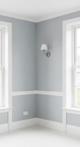
7. Pale Blue Walls + White Trim
This one’s a coastal classic. Pale blue with white trim feels light, airy, and vacation-ready.
Why it works:
-
White keeps it crisp and beachy.
-
Blue feels calm and refreshing.
Perfect for bathrooms or bedrooms where you want all the zen vibes.
8. White Walls + Bold Red Trim
Feeling brave? White walls with red trim make a statement that says, “Yeah, I have style, and I’m not afraid to show it.”
Why it works:
-
The red brings warmth and energy.
-
White keeps it balanced so it’s not overwhelming.
Bonus: Pairs amazingly with mid-century modern furniture.
9. Warm Taupe Walls + Off-White Trim
Want understated elegance? Warm taupe with off-white trim feels rich but subtle.
Why it works:
-
The slight variation in tone adds dimension.
-
Works with both modern and traditional furniture.
This one’s for those who love neutrals but don’t want flat, one-note walls.
10. White Walls + Teal Trim
A little quirky, a little classy—teal trim on white walls turns heads.
Why it works:
-
Teal feels fresh and modern.
-
Adds personality without screaming for attention.
Perfect for creative spaces like studios or reading nooks.
11. Soft Blush Walls + White Trim
Yes, pink walls can look grown-up. Pair them with crisp white trim, and suddenly it’s chic, not “nursery.”
Why it works:
-
White cuts the sweetness of blush.
-
Blush adds warmth and softness.
This combo thrives in bedrooms or powder rooms where you want a feminine touch without going overboard.
12. Sage Green Walls + Cream Trim
Sage is the trend darling of 2025, and with cream trim? Perfection.
Why it works:
-
Cream keeps it warm and cozy.
-
Sage feels earthy and sophisticated.
Also, plants LOVE this combo—visually, at least.
13. White Walls + Dark Blue-Gray Trim
Not quite navy, not quite charcoal—blue-gray trim gives you a moody vibe without going full drama queen.
Why it works:
-
The subtle hint of blue keeps it interesting.
-
Works beautifully in both modern and rustic spaces.
IMO, this is the “cool older sibling” of the classic black-and-white pairing.
Tips for Pulling Off Contrast Trim Without Regret
Alright, so you’ve found your dream combo. Here’s how not to mess it up:
-
Test samples first. Colors look way different depending on lighting.
-
Pick a consistent trim color throughout the house for flow (or at least per floor).
-
Mind the finish. Satin or semi-gloss works best for trim—it’s durable and easy to clean.
-
Don’t ignore the ceiling. Sometimes matching the trim to the ceiling color can make a room feel taller.
Why Contrast Trim Works So Well
Here’s the magic formula: contrast = depth + personality. Trim isn’t just a border—it frames your space, highlights architecture, and guides the eye.
And unlike accent walls (which can feel dated if overdone), contrast trim is timeless. You can change your wall color down the road without replacing the trim—instant refresh.
Final Thoughts
Contrast trim is one of those small design tweaks that punches way above its weight. Whether you go bold with navy or keep it chill with taupe, it’s an easy way to make your home look more expensive, more intentional, and more you.
So, what’s it gonna be—white walls and black trim? Blush and white? Or are you feeling wild with red? Whatever you choose, own it. After all, your home should make you smile every time you walk in.

