Yeah, same. That awful moment when the walls are dry, the furniture’s in place, and you’re like… why does this look like a hospital waiting room?
If you’re here, you’re probably on a mission to spice up your space without gutting it or going full HGTV-reno-mode. And guess what? Contrast trim might just be your new secret weapon. It’s one of those design tricks that looks super fancy but is actually surprisingly easy to pull off.
I’ve been obsessed with contrast trim since the day I realized my plain white baseboards were basically the “socks with sandals” of my living room. So today, I’m dropping 18 tried-and-tested tips to help you pick the right contrast trim colors—without crying into a paint sample booklet for three days straight.
Let’s get into it. 🖌️
1. Understand What “Contrast Trim” Really Means
Okay, quick vocab check.
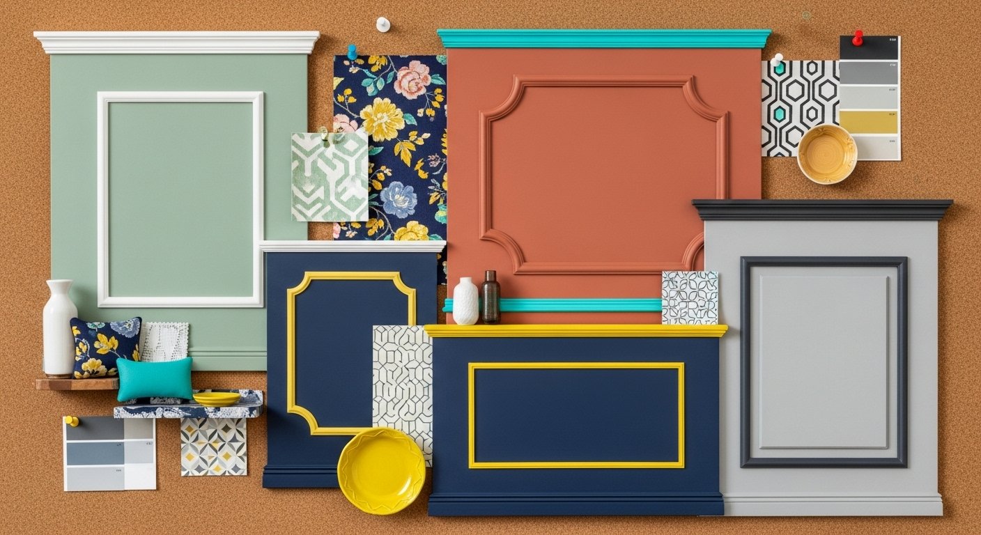
Contrast trim = the color of your doors, window frames, baseboards, or molding is different from your wall color. That’s it. Super simple.
The goal? Highlight architectural details, frame your space, and add personality without screaming for attention (unless you want it to).
2. Start With a Neutral Base
If you’re scared of color—hi, I see you, fellow beige-lover—you’re in luck.
Neutral walls (think soft white, greige, or light gray) make the perfect backdrop for bold trim. You can go moody (black trim), earthy (olive green), or even classic (navy blue).
Pro tip: White walls + black trim = instant modern drama.
3. Think in Reverse Too
Ever thought about flipping the script?
Try painting your walls a deep, moody tone (like charcoal or emerald) and using lighter trim for contrast. This adds visual interest and keeps things from feeling too heavy.
It’s bold, yes—but when done right? Chef’s kiss.
4. Match Your Trim to Your Personality (Seriously)
Do you like bold, spicy vibes? Go for high-contrast combos—like white walls with black or forest green trim.
Are you more of a cozy, warm-tones-everything person? Try cream walls with caramel or terracotta trim.
Your trim color says a lot about you, FYI. Let it speak your language.
5. Look at the Light (No, Really)
Lighting will change everything—don’t say I didn’t warn you.
Natural light = colors appear more accurate.
Fluorescent light = brings out cool tones.
Warm lamps = can distort darker hues.
So before you commit, test your paint colors on multiple spots and check them at different times of day. You’ll thank me later.
6. Use the 60-30-10 Rule (With a Twist)
You’ve heard of it, right? It’s the golden ratio in design:
-
60% dominant color (usually walls)
-
30% secondary (like furniture)
-
10% accent (your trim color)
But in contrast trim land, that 10% packs a punch. Use it to tie in other accents—pillows, rugs, art—without making everything matchy-matchy. We’re going for cohesive, not copy-paste.
7. Ditch the “All White Trim” Rule
Listen. I love a clean white trim as much as the next Pinterest scroller, but it’s not law. You don’t have to default to white.
Instead, ask: “What vibe am I going for?” Warmth? Sophistication? Drama? Then choose accordingly.
Because white trim on a moody wall can sometimes look like… toothpaste. Just saying. 🤷♀️
8. Use Black… But Not Blindly
Black trim is the cool kid right now, and yes—it looks 🔥 in the right space.
But if you use it everywhere, it can feel heavy. Instead:
-
Use it sparingly in open spaces.
-
Pair it with lots of natural light.
-
Balance it with soft textures and fabrics.
Don’t go full Batcave unless you’re into that kinda thing. 😏
9. Try Earth Tones for a Cozy, Inviting Vibe
Warm, earthy tones like moss green, burnt sienna, or ochre work beautifully with creamy white or tan walls.
They add depth without being overwhelming, and they age really well—unlike that trendy teal we all regretted in 2016. (RIP.)
10. Take a Cue From Historic Homes
If you live in a Victorian or Craftsman-style home, you’re basically required by the universe to play with trim.
Many historic homes used deep, rich trim colors—like oxblood, navy, or even dark teal—to show off all that architectural goodness.
Wanna add character without faking it? This is the move.
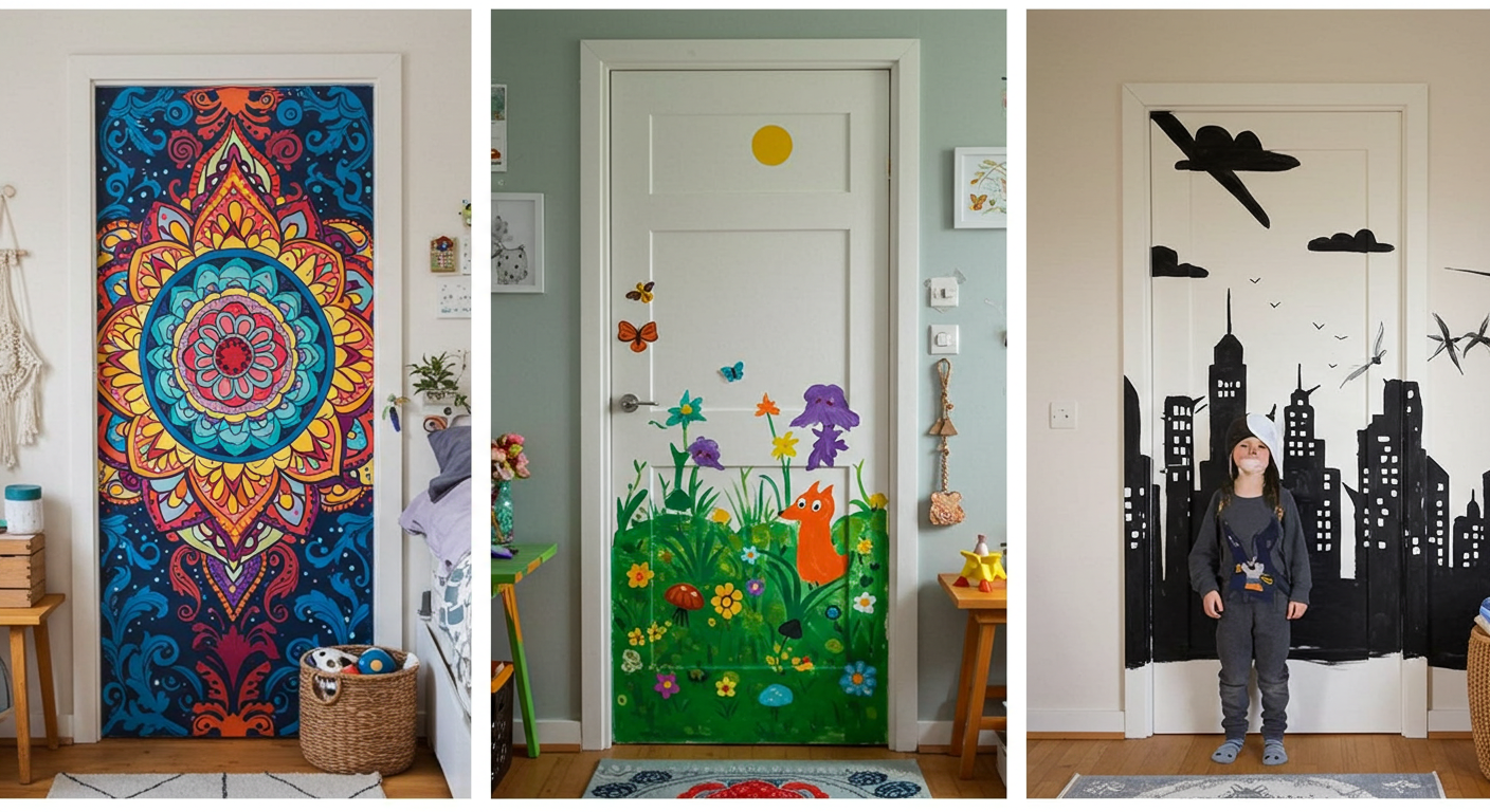
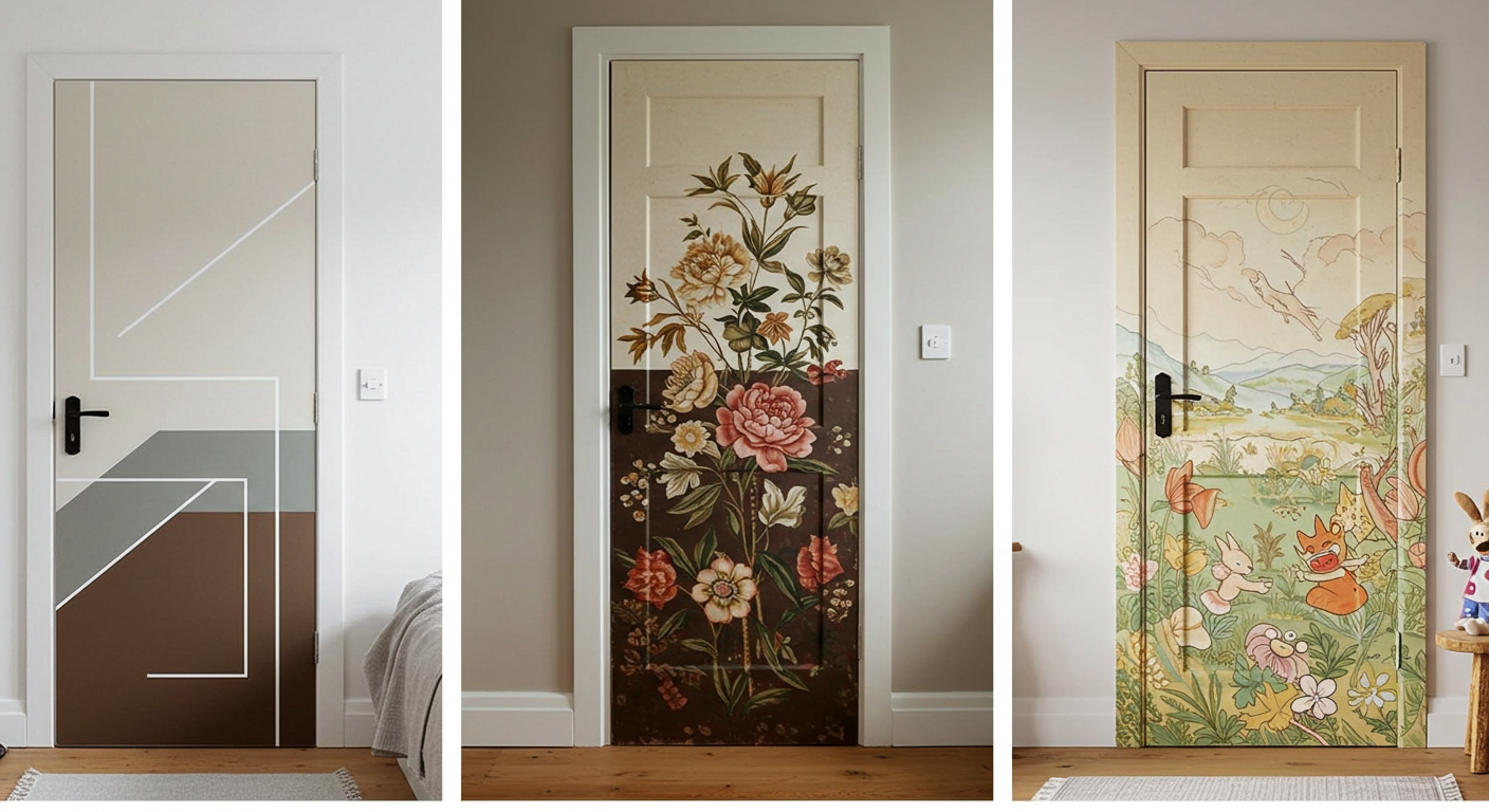
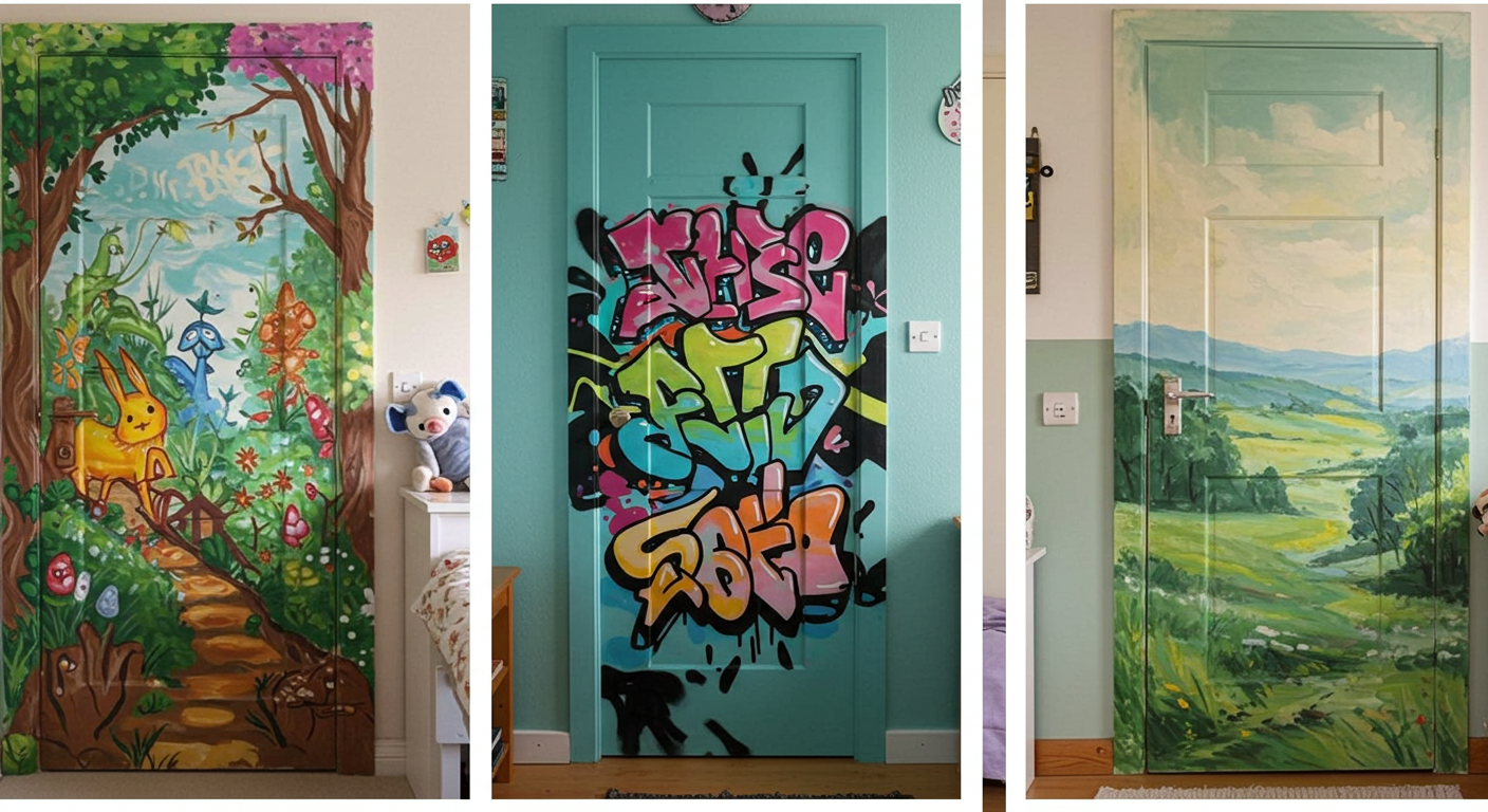
11. Don’t Forget the Doors!
Trim doesn’t just mean baseboards. Your interior doors are fair game too!
Painting your doors the same bold shade as your trim = clean, unified look.
Just promise me you won’t paint the door only and leave the trim plain. That’s like wearing a tuxedo jacket with sweatpants. No bueno.
12. Gloss Finish? Matte? Somewhere in Between?
Here’s the deal:
-
Glossy trim = fancier, easier to clean.
-
Matte or eggshell = more modern, subtle.
In high-traffic areas (hallways, kitchens), I usually go for satin or semi-gloss—because scuff marks are inevitable. In chill zones (like bedrooms), matte works just fine.
13. Use Peel & Stick Paint Samples
Want to test a bunch of options without turning your wall into a Jackson Pollock piece?
Try peel-and-stick paint samples. I’ve used them. Game-changer. No mess. No commitment. No regrets.
Well, unless you choose beige. Then… maybe a few regrets 😅.
14. Think Beyond Walls and Trim
Here’s a fun thought: why not pull your trim color into other things?
-
Throw pillows
-
Picture frames
-
Kitchen stools
-
Area rugs
This brings the room together without making it feel over-designed. You know when something just feels right? That’s usually why.
15. Test Your Color in Different Rooms
Just because “Deep Navy” looks amazing in your office doesn’t mean it’ll work in the hallway.
Every room has its own light, layout, and energy. So test accordingly. Trust me, I learned this the hard way with a peachy trim that turned straight-up orange under LED lights. Never again.
16. Play With Tone-on-Tone Contrast
Want something subtle but still visually interesting?
Try tone-on-tone trim. For example:
-
Pale gray walls + dark gray trim.
-
Soft blush walls + dusty rose trim.
It’s elegant, modern, and lets you show off without yelling, “LOOK AT ME!”
17. Go Monochrome (But Not Boring)
Feeling bold? Try painting the walls, trim, and ceiling all the same color.
Yup. You heard me.
This creates a dramatic cocoon effect that looks especially stunning in small spaces like powder rooms or offices.
Add texture with furniture and fabrics to keep it from feeling flat.
18. Trust Your Gut. Seriously.
This might be the most important tip.
If a color makes you feel something, go with it. Your home should reflect you, not some trend checklist from a random magazine.
Unless that color is neon lime. Then maybe sleep on it first. 🙂
Wrapping It Up: Your Trim, Your Rules
There you have it—18 solid tips to help you choose the perfect contrast trim colors for your home.
At the end of the day, don’t stress about being “right.” Trends come and go. Paint is fixable. What matters is how you feel in your space.
So go ahead—be bold. Get weird. Make mistakes. That’s the fun of it!
And hey, if you nail it on the first try, I fully expect a humble brag pic in my inbox. 😉
Now grab that brush and show those baseboards who’s boss

