Understanding Cherry Red as an Accent Color
Cherry red is a vibrant hue that carries significant weight in the realm of interior design. As an accent color, it is often employed to inject a sense of warmth and energy into a space. The psychological effects of cherry red are notable; the color tends to evoke feelings of passion, excitement, and even comfort. These attributes can transform the atmosphere of a room, making it feel more inviting and dynamic, which is particularly beneficial in areas meant for social interaction, such as living rooms and dining spaces.
Culturally, cherry red has various associations that can vary by region. For instance, in some cultures, it symbolizes prosperity and good fortune, while in others, it may represent love and desire. Such diverse meanings can enrich the aesthetic quality of an interior, allowing homeowners to express their personality or cultural heritage through their design choices. This multifaceted nature of cherry red contributes to its selection as a preferred accent color over more subdued shades; it helps create visual focal points without overwhelming the overall design.
When considering cherry red as an accent, it is paramount to apply it thoughtfully. The key is to balance this bold color with neutral tones or softer shades to prevent it from overpowering the overall scheme. Cherry red works harmoniously with colors like white, beige, or light gray, which can allow the vibrancy of the red to pop without leading to visual chaos. By using cherry red strategically as an accent, homeowners can achieve a harmonious look that feels both lively and coherent. Ultimately, when applied correctly, cherry red can enhance the aesthetic appeal of a room, ensuring it remains an engaging and lively space.
Choosing the Right Shades and Textures
When incorporating cherry red accents into your interior design, selecting the right shades and textures is paramount to achieving a balanced and cohesive space. Cherry red is a vibrant and bold color that can energize a room, but if used excessively or incorrectly, it can dominate the environment. Therefore, one must consider complementary colors that can soften the intensity of cherry red. Shades such as soft grays, creams, and muted earth tones work beautifully alongside cherry red, providing a calming counterbalance.
In addition to complementary colors, the texture of materials plays a significant role in how cherry red is perceived in a space. Opting for soft textiles, such as plush throw pillows or cozy blankets, can create an inviting atmosphere while allowing the cherry red accents to shine without overwhelming the decor. Fabrics like velvet or chenille add warmth, while also enriching the space with depth. On the other hand, incorporating glossy surfaces, such as lacquered furniture or glass decorations, can reflect light and provide an elegant contrast to the richness of cherry red. This variation in textures helps to create visual interest and prevents a flat appearance.
Moreover, when mixing different tones of cherry red, it is crucial to maintain harmony. Using a range of cherry reds—from deep crimson to lighter shades—can create an eye-catching ensemble. However, ensuring that these variations are distributed evenly throughout the space helps prevent one area from becoming too bold. Incorporating smaller accents of cherry red through picture frames, artwork, or decorative vases can subtly enhance overall aesthetics without overpowering the room. By carefully selecting your shades and textures, you can effectively introduce cherry red accents into your space, achieving a stunning and sophisticated look.
Strategic Placement of Cherry Red Accents
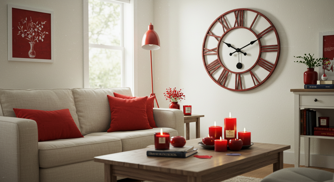
Incorporating cherry red accents into your home design can invigorate a space, yet it is crucial to place these vibrant elements strategically to avoid overwhelming the overall aesthetic. The impact of color placement can significantly influence the mood and flow of a room. Understanding how to best leverage cherry red while maintaining balance is key to achieving visual harmony.
Begin by identifying the primary color palette within your environment. Cherry red works exceptionally well as an accent against neutral shades such as whites, grays, and beiges. Consider introducing cherry red through smaller furniture pieces like a side chair or an ottoman. These items can serve as focal points without dominating the room. Position these pieces near key areas like reading nooks or adjacent to larger furniture to create an inviting atmosphere.
Decorative accessories are another excellent avenue for accentuating cherry red. Items such as throw pillows, vases, and rugs can seamlessly integrate this hue into your space. For example, a cherry red throw pillow on a beige sofa can draw the eye without overwhelming it. Moreover, be mindful of proportions; placing cherry red accents in mismatched sizes can create a more dynamic look. For instance, pair a small cherry red vase with a larger, neutral-toned centerpiece to maintain visual balance.
Artwork is yet another meaningful way to infuse cherry red into your decor. A piece featuring cherry red hues can serve as a bold statement while remaining within the overall color scheme. Hanging such artwork in a prominent position can anchor your space and provide a splash of color that ties disparate elements together.
In summary, placing cherry red accents thoughtfully can elevate your space’s aesthetic without overshadowing it. By embracing a harmonious balance of color through furniture, decor, and artwork, you can create a visually engaging environment that showcases the beauty of cherry red. Remember to consider scale, proportions, and the surrounding color palette for optimal results.
Avoiding Common Mistakes When Using Cherry Red
Incorporating cherry red accents into a living space can introduce a vibrant energy, yet it is essential to approach this bold color with caution to avoid typical pitfalls. One common mistake is over-saturation, where excessive amounts of cherry red overwhelm the overall aesthetic. To maintain balance, it is advisable to use cherry red in moderation. For instance, instead of painting an entire wall, consider using cherry red on smaller elements such as throw pillows, art pieces, or a statement chair. These targeted applications can accentuate the color without dominating the room.
Another frequent error is neglecting other design elements, which can result in a disjointed appearance. When introducing cherry red, it is crucial to assess the existing color palette and ensure that cherry red complements other hues found in the space. For example, pairing cherry red accents with neutral tones, such as gray or beige, can create a harmonious atmosphere. Additionally, incorporating varying textures—like a glossy cherry red vase against a matte neutral table—can enhance visual interest while keeping the focus balanced.
Moreover, it is vital to ensure that cherry red enhances rather than competes with existing decor. To achieve this, one should consider the overall theme of the room. If the design leans towards modern aesthetics, opt for sleek cherry red finishes to convey sophistication. Conversely, in a more traditional setting, rich cherry red fabrics can add warmth. Always evaluate how the cherry red accents interact with surrounding elements to avoid clashes. By being mindful of these common mistakes, you can create a dynamic and inviting space where cherry red accents contribute positively to your overall design vision.